Details about TW Elements - 500+ free components
500+ Tailwind CSS components
117+ design blocks
Dark mode & theming support
Integrations with React, Vue, Angular, Svelte, Laravel, and more
Open-source with optional PRO upgrade
Quick install via npm, CDN, or ZIP
Free for personal & commercial use
#What is TW Elements
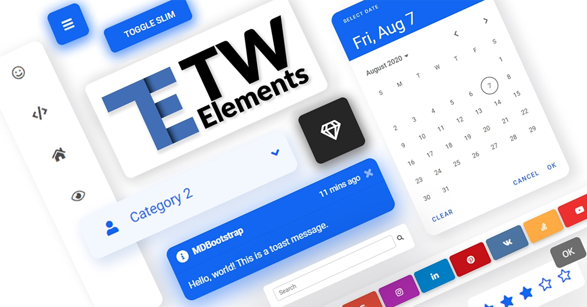
TW Elements is a comprehensive open-source UI kit built on Tailwind CSS. It offers a vast collection of over 500 pre-built components and 117+ design blocks, enabling developers and designers to rapidly prototype and build modern, responsive interfaces. With built-in support for dark mode, theming, and seamless integration with popular frameworks like React, Vue, Angular, Svelte, and Laravel, TW Elements streamlines the development process and enhances productivity.
#Features
Extensive Component Library: Access to over 500 components, including buttons, modals, forms, and more.
Design Blocks: 117+ pre-designed sections like hero areas, pricing tables, and testimonials.
Dark Mode Support: Easily toggle between light and dark themes using Tailwind's dark variant.
Theming & Customization: Customize components to match your brand with ease.
Framework Integrations: Official support for React, Vue, Angular, Svelte, Laravel, and more.
Quick Installation: Install via npm, CDN, or download as a ZIP package.
Open Source: Free for both personal and commercial use.
PRO Version Available: Access to premium components and templates with a paid plan.
#Pros and Cons
#Pros
Comprehensive Library: A vast array of components and design blocks to accelerate development.
Framework Compatibility: Seamless integration with major frontend frameworks.
Customization: High flexibility in theming and styling components.
Responsive Design: Components are mobile-friendly and adapt to various screen sizes.
Active Community: Regular updates and a supportive community for troubleshooting.
#Cons
Learning Curve: Beginners might need time to familiarize themselves with Tailwind CSS conventions.
Limited Advanced Components: Some complex components may require additional customization.
Documentation Depth: While comprehensive, some areas of documentation could be more detailed.
#Included Components - Templates
TW Elements offers a rich set of components and templates, including:
UI Components: Buttons, modals, alerts, accordions, carousels, and more.
Forms: Input fields, checkboxes, radio buttons, date pickers, and validation.
Navigation: Navbars, sidebars, breadcrumbs, tabs, and pagination.
Data Display: Tables, charts, badges, and progress bars.
Design Blocks: Hero sections, pricing tables, testimonials, FAQs, and contact forms.
#Pricing
TW Elements operates on a freemium model:
Free Version: Access to a wide range of components and design blocks.
PRO Version: Offers additional premium components and templates.
#Integrations
TW Elements provides integration guides for various frameworks and platforms:
Frontend Frameworks: React, Vue, Angular, Svelte, and SvelteKit.
Backend Frameworks: Laravel, Django, Express, and ASP.NET.
Static Site Generators: Next.js, Nuxt.js, Remix, and Qwik.
These integrations ensure that developers can seamlessly incorporate TW Elements into their existing projects.
Frequently Asked Questions
Is TW Elements free to use for commercial projects?
Yes, TW Elements is open-source and free for both personal and commercial use.
How do I install TW Elements in my project?
You can install TW Elements via npm, CDN, or by downloading the ZIP package.
Does TW Elements support dark mode?
TW Elements has built-in support for dark mode, allowing easy toggling between light and dark themes.
Can I use TW Elements with React or Vue?
Absolutely. TW Elements offers official integration guides for React, Vue, and other popular frameworks.
What additional features are available in the PRO version?
The PRO version provides access to premium components, templates, and design blocks, enhancing the UI/UX capabilities of your projects.
Are there any design tools included with TW Elements?
Yes, TW Elements offers tools like button generators, card generators, and flexbox generators to assist in rapid UI development
TW Elements - 500+ free components
UI components, templates, and plugins for Tailwind CSS.
Resource Types:
UI Kits :
Tailwind UITechnology Stack :


Have a product?
Submit your Tailwind CSS product to All Tailwind, get featured, and drive genuine traffic while showcasing your work to the world. Turn your creativity into revenue and begin selling today! 🚀