Tailwind Display
Best collection of Tailwind CSS display components. Easily control layout and responsiveness with utility classes like block, flex, grid, and more.
Explore Display


Latest Tailwind Display
Submit ProductFilters
Filters
Technology Stack
UI Kits

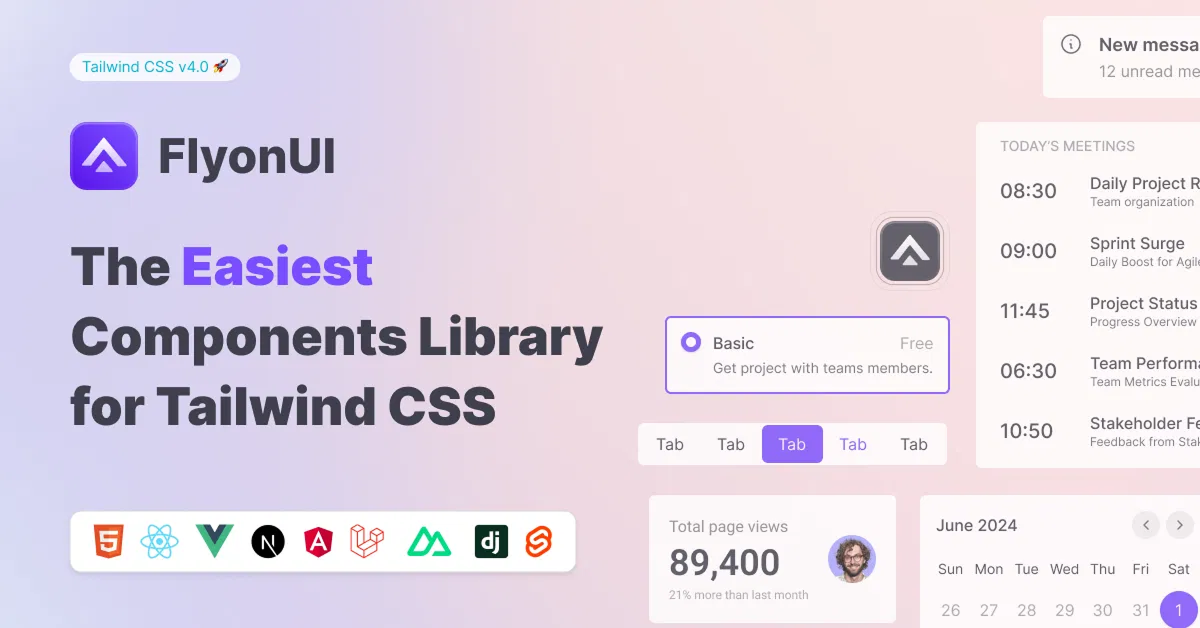
FlyonUI - Free Tailwind CSS Components
Open-source Tailwind CSS components library.

Shadcn for Vue - Shadcn/Vue
Beautifully designed components built with Radix Vue and Tailwind CSS.

JollyUI
Shadcn/UI components: accessible, customizable, open-source.

Circle by lndev-ui
Project management app, built with Next.js and Shadcn/UI.


Tailblocks — Ready-to-use CSS blocks
Ready-to-use Tailwind CSS blocks

TW Elements - 500+ free components
UI components, templates, and plugins for Tailwind CSS.

Pines - Alpine and Tailwind UI Library
Library of animations, sliders, and modals for Alpine & Tailwind.


Shadcn/Studio - Theme Editor
Open-source Shadcn registry with copy-paste components.
MynaUI Icons
Beautifully crafted open source icons for your next project.

RippleUI - TailwindCSS Components
Modern, clean Tailwind CSS components for a responsive, seamless UX.

Tailwind CSS Component Library | WindUI
Enhance projects with responsive UI components in React and HTML.


Indie UI: Component Library
Easily enhance your website with React, Shadcn, and Framer Motion.

Sailboat UI - UI component library
Start quickly with 150+ Tailwind CSS components using Sailboat UI.

HyperUI - Open Source Tailwind Components
A collection of free open-source Tailwind CSS components.
Best Collection for Tailwind CSS Display Components:
The Display component in Tailwind CSS is a fundamental utility that controls how elements are displayed on a webpage. Tailwind’s utility-first approach allows you to adjust the display property of an element without writing custom CSS, making it easier to create responsive, flexible layouts.
At All TailwindCSS we have gathered the best Tailwind Display components.
What is the Display Property?
The display property in CSS defines how an element behaves in terms of layout. Common values include block, inline, inline-block, flex, grid, and none. Tailwind provides utility classes to set these values quickly and efficiently.
Tailwind CSS Display Utilities:
Here are the most commonly used display utility classes in Tailwind CSS:
blockDescription: Makes an element a block-level element, meaning it will take up the full width of its parent container and start on a new line.
Usage:
<div class="block">Content</div>
inlineDescription: Makes an element inline, meaning it will only take up as much width as necessary and flow inline with other elements.
Usage:
<span class="inline">Text</span>
inline-blockDescription: Makes an element behave like a block element but only take up as much space as its content. It allows elements to sit next to each other.
Usage:
<button class="inline-block">Button</button>
flexDescription: Turns the element into a flex container, allowing you to use the full power of Flexbox layout. This is ideal for aligning and distributing space between child elements.
Usage:
<div class="flex">Content</div>
inline-flexDescription: Similar to
flex, but the container behaves like an inline element. This allows flex elements to be aligned inline.Usage:
<div class="inline-flex">Flex Content</div>
gridDescription: Turns the element into a grid container, enabling you to create grid layouts with ease.
Usage:
<div class="grid grid-cols-3">Grid Items</div>
inline-gridDescription: Similar to
grid, but the grid container behaves like an inline element.Usage:
<div class="inline-grid grid-cols-3">Grid Items</div>
hiddenDescription: This utility hides the element by setting
display: none, which completely removes it from the layout.Usage:
<div class="hidden">Hidden Content</div>
Responsive Display Utilities
Tailwind CSS also provides responsive variants for the display property, making it easy to change how elements are displayed on different screen sizes. Here's how you can use them:
sm:blockDisplays an element as a block on small screens (
smbreakpoint).Usage:
<div class="sm:block md:hidden">Responsive Content</div>
md:flexChanges the element to a flex container at the medium screen size (
mdbreakpoint).Usage:
<div class="md:flex lg:block">Responsive Flexbox</div>
lg:gridSets the element to a grid container at the large screen size (
lgbreakpoint).Usage:
<div class="lg:grid xl:block">Responsive Grid</div>
Use Cases for Tailwind Display Component
Aligning items: With
flexandgrid, Tailwind CSS makes it easy to align elements in a row or column, and even create complex layouts without additional CSS.Responsive layouts: By combining Tailwind's display utilities with responsive breakpoints, you can create layouts that adjust to different screen sizes automatically.
Hiding elements: The
hiddenclass is useful for creating responsive designs, such as hiding certain elements on smaller screens or showing elements only on specific devices.
Example of Display Utility in Action
Here’s a simple example of how you can use the flex and hidden utilities together to create a responsive navbar:
<div class="flex sm:hidden">
  <button class="p-2 text-white">Menu</button>
  <a href="#" class="text-white">Home</a>
  <a href="#" class="text-white">About</a>
</div>
<div class="hidden sm:flex">
  <a href="#" class="text-white">Home</a>
  <a href="#" class="text-white">About</a>
  <a href="#" class="text-white">Contact</a>
</div>
In this example, the first navigation menu is shown only on small screens (sm:hidden), while the second is displayed on larger screens (sm:flex).
Conclusion
The Tailwind CSS display component provides a simple and efficient way to manage the layout of your elements with minimal code. Whether you’re creating a basic layout or a complex responsive design, these utilities make it easy to adapt your content to any screen size. By using Tailwind’s utility classes for display properties like block, flex, grid, and hidden, you can quickly build flexible, modern, and responsive web layouts.
Well, you can simply find the best collection of Tailwind Components like display components on All TailwindCSS, such as:
Frequently Asked Questions
Explore frequently asked questions about Display
It controls how elements are displayed, such as block, inline, flex, grid, or none.
Use the flex class to create a flex container, e.g., <div class="flex">Content</div>.
Have a product?
Submit your Tailwind CSS product to All Tailwind, get featured, and drive genuine traffic while showcasing your work to the world. Turn your creativity into revenue and begin selling today! 🚀