Tailwind Blog Templates & Themes
Curated collection of Tailwind CSS blog templates & themes designed for modern, responsive, and customizable blogging.
Explore Blog Templates

Featured Tailwind Products
Add Featured Product
JetShip - Next.js SaaS Boilerplate
Next.js Starter Kit with TypeScript, Shadcn, Tailwind & Supabase.

Vuexy MUI Next.js Template
By Pixinvent
Vuexy MUI NextJS Admin Template with modern layouts and UX design.


Latest Tailwind Blog Templates
Submit ProductFilters
Filters
Technology Stack
UI Kits

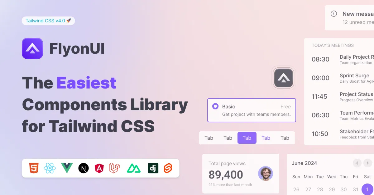
FlyonUI - Free Tailwind CSS Components
Open-source Tailwind CSS components library.

Shadcn/Studio - Theme Editor
Open-source Shadcn registry with copy-paste components.
The Best Tailwind CSS Blog Templates & Themes
When building a blog, the design, readability, and user experience are crucial to creating an engaging platform for your readers. Whether you're a writer, influencer, or business looking to share content, having a well-structured and aesthetically pleasing blog is essential. This is where Tailwind CSS blog templates come into play.
These templates provide a clean, responsive, and highly customizable foundation for building a modern blog with ease, while allowing you to focus on creating content rather than design intricacies.
At All TailwindCSS, you will find the best Tailwind CSS Blog templates for your upcoming project.
What Are Tailwind CSS Blog Templates?
Tailwind CSS blog templates are pre-designed layouts built using Tailwind CSS, a utility-first CSS framework. These Tailwind CSS templates are specifically designed for bloggers and content creators, providing a ready-made structure to display articles, images, videos, and other content types in a user-friendly manner. The templates come with essential blog features like a homepage, individual post pages, a navigation menu, and a footer, all optimized for performance and readability.
What sets these templates apart is their use of Tailwind CSS, which provides flexibility and ease of customization through utility classes, allowing you to modify the design according to your preferences without needing to write extensive CSS from scratch.
Why Use Tailwind CSS Blog Templates?
Using a Tailwind CSS blog template can provide numerous benefits, especially if you want to get your blog up and running quickly without sacrificing design or performance. Here's why it's a great choice:
Speedy Setup: With pre-designed components and layout structures, Tailwind blog templates drastically reduce the amount of time you need to spend building a blog from the ground up. You can get started with minimal effort and focus on creating high-quality content.
Highly Customizable: Tailwind's utility-first approach means you can easily adjust elements like colors, typography, spacing, and layout without writing extensive CSS. The flexibility Tailwind offers ensures that you can fully customize the template to reflect your personal or brand identity.
Responsive Design: Tailwind blog templates are designed to be mobile-first, meaning they are fully responsive and look great on all devices, from mobile phones to large desktop monitors. This ensures your readers enjoy a smooth, consistent experience regardless of their device.
SEO-Friendly: The clean, semantic HTML generated by Tailwind CSS templates helps improve SEO performance. Well-structured templates with proper heading tags, meta descriptions, and fast loading times can boost your blog's visibility in search engines.
Performance Optimized: Tailwind’s utility-first approach reduces the amount of unnecessary CSS in your project, ensuring that your blog loads faster and provides an excellent user experience. This optimization helps improve both performance and SEO.
Modern and Aesthetic Design: Tailwind's design principles encourage a clean, minimalistic, and aesthetically pleasing design, allowing your content to stand out. With a modern layout, your blog will look fresh and professional, giving readers an enjoyable browsing experience.
Key Benefits of Tailwind CSS Blog Templates
Customizable Layouts: Tailwind templates offer various layout options, allowing you to display your content in an organized and appealing manner.
Content-Centric Design: The templates prioritize readability, with well-defined typography, margins, and spacing, ensuring that your content is the focal point of your blog.
Built-in Components: Many Tailwind blog templates come with essential components like article previews, author bios, comment sections, related post links, and social sharing buttons.
Clean and Maintainable Code: The use of utility classes ensures that the code remains clean, maintainable, and easy to extend as your blog grows.
Lightweight and Fast: Tailwind templates are often lightweight, contributing to faster page load times and a better overall user experience.
Cross-Browser Compatibility: Tailwind ensures that your blog will function seamlessly across all major browsers, providing a consistent experience for your audience.
Must Have Components of Tailwind CSS Blog Templates
When choosing a Tailwind CSS blog template, look for the following key components to ensure it meets your needs:
Header/Navigation Bar: Includes the blog logo, navigation links, and search functionality. It may also feature social media icons and a collapsible mobile menu.
Hero Section: A visually appealing introductory section with a background image, headline, and a CTA button to drive engagement.
Blog Listing Page: Displays post previews with titles, images, and summaries, with pagination or sorting options to navigate through content.
Individual Post Layout: Displays content with an author bio, publication date, main text, featured images, social sharing buttons, and a comment section.
Sidebar: (Optional) Contains additional content like recent posts, categories, author bio, search bar, and social media links.
Footer: Includes copyright info, navigation links, and possibly social media icons or a newsletter signup.
Typography: Customizable text elements ensuring readability, including headings, paragraphs, and blockquotes.
CTA Buttons: Action-oriented buttons (e.g., "Subscribe," "Read More") with hover effects for user interaction.
Comments Section: Allows readers to leave feedback with reply and moderation options, integrating with third-party services like Disqus.
Search Functionality: Provides a search bar with filtering options to help users find content quickly.
Pagination/Infinite Scroll: Allows users to navigate between multiple pages of content or load more posts as they scroll.
Responsive Layout: Ensures your blog is mobile-friendly with fluid grids and media queries for different screen sizes.
Why Tailwind CSS Blog Templates Are Perfect for Bloggers?
For bloggers, Tailwind CSS blog templates offer a perfect blend of design, performance, and ease of use. These templates are highly customizable, allowing bloggers to personalize their site according to their brand or personal style. Whether you're a beginner or an experienced developer, the simple utility classes in Tailwind make it easy to adjust the layout and styling without the need for complex code.
Additionally, the performance optimizations inherent in Tailwind’s utility-first framework ensure that your blog loads quickly, which is essential for keeping readers engaged and improving SEO rankings.
Conclusion:
Tailwind CSS blog templates offer an efficient, customizable, and performance-optimized solution for building a modern blog. Whether you're a content creator, writer, or business, these templates help you focus on creating high-quality content while providing a sleek and responsive design. By using Tailwind, you can ensure that your blog is fast, mobile-friendly, and SEO-optimized—important factors that will help you attract and retain readers.
If you’re looking to start a blog or revamp your existing one, consider using a Tailwind CSS blog template. It’s the ideal foundation for building a beautiful, functional, and user-friendly blogging platform.
So, what are you waiting for, start exploring the curated collection of best Tailwind CSS Blog Templates & Themes At All TailwindCSS.
Frequently Asked Questions
Explore frequently asked questions about Blog Templates
A pre-designed blog layout built using Tailwind CSS, offering flexibility and easy customization for creating modern blogs.
Yes, they are responsive and optimized for mobile, ensuring your blog looks great on all devices.
Have a product?
Submit your Tailwind CSS product to All Tailwind, get featured, and drive genuine traffic while showcasing your work to the world. Turn your creativity into revenue and begin selling today! 🚀