Tailwind CSS Buttons
Explore a variety of customizable Tailwind CSS buttons for your web projects. Make your design interactive and catchy.
Explore Buttons


Latest Tailwind Buttons
Submit ProductFilters
Filters
Technology Stack
UI Kits

FlyonUI - Free Tailwind CSS Components
Open-source Tailwind CSS components library.

Next.js + Tailwind CSS + TypeScript Starter
An Open Source Next.js, Tailwind CSS, and TypeScript Boilerplate.

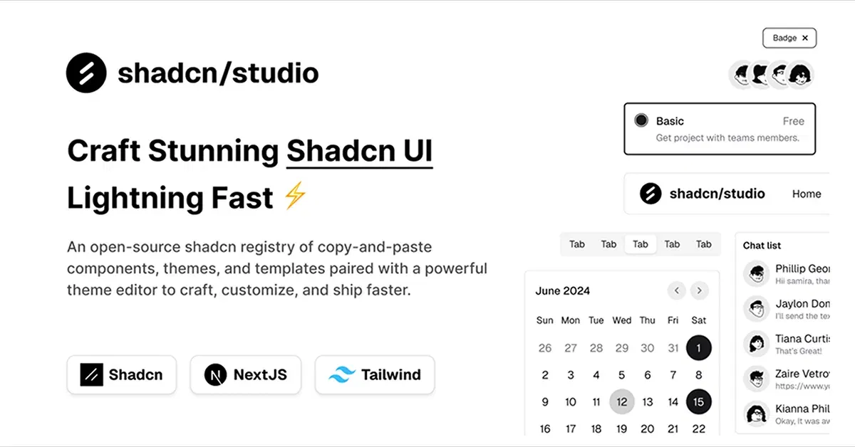
Shadcn/Studio - Theme Editor
Open-source Shadcn registry with copy-paste components.
Tailwind Buttons: Simple, Stylish, and Easy to Use
Buttons are essential to any website or app. They help users take action, whether it’s submitting a form, navigating to another page, or completing a task. When it comes to styling buttons, Tailwind CSS makes it super easy to create beautiful, functional buttons that fit any design.
At All TailwindCSS, you will find the best Tailwind Buttons collection.
What Is A Tailwind Button?
A Tailwind button refers to a button element styled using Tailwind CSS, a utility-first CSS framework that allows developers to design and customize components using pre-defined utility classes. Tailwind makes button design straightforward by offering a wide range of utility classes to control the button's appearance and behavior without needing to write custom CSS.
Why Tailwind Buttons?
Tailwind CSS is known for its utility-first approach, meaning you can build out buttons quickly using predefined classes. This saves you time and effort, and lets you easily customize your buttons without writing any extra CSS. Whether you're looking for a simple design or something more complex, Tailwind has you covered with everything you need to create the perfect button.
Key Features of a Tailwind Button:
Utility-First Approach: Tailwind buttons are created by applying utility classes like
bg-color,text-color,padding, andborderdirectly to the button element. This approach lets you quickly customize buttons without worrying about writing separate CSS rules.Customization: You can easily adjust a button's color, size, border-radius, padding, and other styles by adding or modifying utility classes. For example, you can change the button’s background color, make it larger, or add a hover effect with simple class changes.
Responsive and Interactive: Tailwind buttons are fully responsive and can include interactive features like hover effects, focus states, and disabled states. Tailwind provides classes like
hover:bg-color,focus:ring, anddisabled:bg-colorto control button behavior when interacting with the user.Consistency and Flexibility: Since Tailwind uses a consistent set of utility classes, it ensures that buttons throughout your website or app have a uniform look while still allowing for unique customizations based on the context.
Different Button Styles
Tailwind components allows you to create various button styles that can be used in different contexts. Here are some popular styles to consider:
1. Basic Buttons
Basic buttons are perfect for primary actions like submitting forms or confirming a selection. They are usually solid-colored and stand out on the page. With Tailwind, you can easily make these buttons interactive with hover effects that change their color when users move their mouse over them.
2. Outline Buttons
Outline buttons are often used for secondary actions. They have a thin border, and while they don’t stand out as much as primary buttons, they’re still easily visible and interactive. These buttons are a great choice when you want a more minimalistic approach but still need clear calls to action.
3. Ghost Buttons
Ghost buttons have a clean and minimal design with a transparent background and a thin border. They are perfect for when you want to keep things subtle but still need the user to click on something. These are often used for less critical actions like "Cancel" or "Go Back."
Customizing Button Sizes
Tailwind makes it easy to adjust the size of your buttons based on what you're trying to achieve. If you need a small button for a compact form, a medium button for most use cases, or a large button for more prominent calls to action, Tailwind has you covered. You can easily tweak the padding and font size to match your design.
Adding Icons to Your Buttons
Icons can add a fun and functional element to your buttons. You can use icons to represent actions (like a "next" or "submit" button) or simply to make the button more visually appealing. With Tailwind, you can add icons to buttons with ease, helping users understand exactly what the button does without reading too much text.
Hover Effects for Interactive Feedback
Adding hover effects to buttons is an important part of creating a polished and interactive user experience. Tailwind CSS allows you to change the appearance of buttons when a user hovers over them. This feedback reassures users that they are interacting with a clickable element. A simple hover effect like changing the color or adding a subtle animation can make a big difference in your design.
Conclusion:
Tailwind CSS simplifies button creation by offering customizable, responsive, and stylish button components. Whether you're building a basic button for a form, an outline button for a secondary action, or a ghost button for minimal designs, Tailwind gives you all the tools you need to create buttons that look great and perform even better.
With just a few clicks, you can make your buttons stand out, ensuring a better user experience. Tailwind’s utility-first approach means you can spend less time writing custom code and more time focusing on what matters i.e. building great user interfaces.
Frequently Asked Questions
Explore frequently asked questions about Buttons
A Tailwind button is a button element styled using the utility classes from the Tailwind CSS framework, allowing for easy customization.
Yes, you can change the button’s color by applying different background (bg-), text (text-), and hover (hover:bg-) classes.
Have a product?
Submit your Tailwind CSS product to All Tailwind, get featured, and drive genuine traffic while showcasing your work to the world. Turn your creativity into revenue and begin selling today! 🚀