Tailwind CSS Tables
Discover the collection of the best Tailwind CSS table components for responsive, & customizable data displays.
Explore Tables

Featured Tailwind Products
Add Featured Product


Latest Tailwind Tables
Submit ProductFilters
Filters
Technology Stack
UI Kits

FlyonUI - Free Tailwind CSS Components
Open-source Tailwind CSS components library.

8bitcn/ui
Accessible retro components that you can copy and paste for your apps.

JollyUI
Shadcn/UI components: accessible, customizable, open-source.

Origin UI - Beautiful UI components
Free, open-source, copy-paste components for building app UIs.

Cult UI – Shadcn UI Components & Templates
Open-source Shadcn UI components and templates for TypeScript/Next.js.

Tailwind Stamps - Resuable HTML Components
Open source collection of reusable TailwindCSS HTML Components.

TW Elements - 500+ free components
UI components, templates, and plugins for Tailwind CSS.

Sailboat UI - UI component library
Start quickly with 150+ Tailwind CSS components using Sailboat UI.

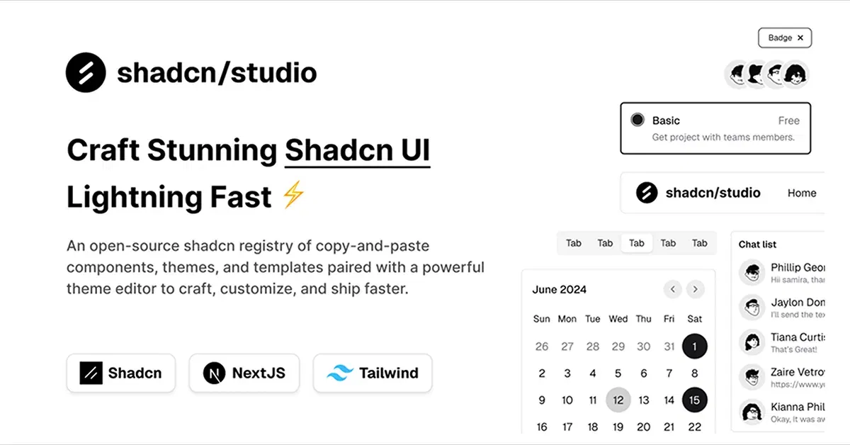
Shadcn/Studio - Theme Editor
Open-source Shadcn registry with copy-paste components.
The Power of Tailwind CSS Table Components for Your Web Projects
Tables are essential for displaying structured data in a clean and organized way. Whether you're building a dashboard, admin panel, or a data-driven application, well-designed tables enhance readability and user experience. Tailwind CSS provides a range of powerful table components that allow developers to create responsive, customizable, and visually appealing tables without the hassle of writing complex CSS.
Why Use Tailwind CSS Table Components?
Tailwind CSS tables offer an efficient and flexible way to display data on your website. Using Tailwind’s utility-first classes, you can quickly create tables with various styles and features that cater to your project’s needs. Here’s why using Tailwind CSS table components is a great choice:
Easy Customization: Tailwind's utility-first approach allows you to easily customize the design of tables. You can adjust colors, borders, text alignment, padding, and more—all directly within your HTML using utility classes. This makes it simpler to match your table’s design with the overall look of your site.
Responsive Design: Tailwind’s tables are built to be responsive out of the box. You can make them mobile-friendly by adding specific classes that adjust how tables are displayed on smaller screens, ensuring that your data remains accessible across all devices.
Minimalist Aesthetic: Tailwind tables offer a minimalist, clean look by default. This allows you to display data without unnecessary distractions, keeping the focus on the content while maintaining a polished appearance.
Performance-Optimized: Since Tailwind is a utility-first CSS framework, it allows you to only include the styles you actually use, making the overall CSS lightweight and performance-optimized. This is particularly important for data-heavy tables, as it helps improve load times.
Highly Accessible: Tailwind's approach to building tables includes best practices for accessibility, ensuring your tables are user-friendly and can be easily navigated by screen readers. This is crucial for creating inclusive web experiences.
Key Features of Tailwind CSS Table Components:
Tailwind CSS table components come with a variety of features that make them easy to use and adapt for different projects:
Striped Rows: Easily create tables with alternating row colors to improve readability. This feature helps users track rows of data more easily.
Hover States: Add hover effects to table rows or cells, providing users with visual feedback when they interact with the data.
Pagination Support: Many Tailwind table components come with built-in pagination options, allowing you to break up large data sets into smaller, more digestible chunks.
Sortable Columns: Some advanced table components allow for sorting by column, enabling users to reorder the data based on specific criteria.
Responsive Layouts: Tables are designed to adapt to smaller screens. For example, on mobile, tables can display as stacked data or scroll horizontally to maintain readability without breaking the layout.
Borders and Spacing: Tailwind allows you to easily control the table’s borders, padding, and spacing, ensuring your data is neatly organized without feeling cluttered.
Benefits of Using Tailwind CSS Table Components
Time-Saving: By using pre-designed components, you save the time it takes to build tables from scratch. Tailwind’s utility classes let you focus more on functionality and less on design adjustments.
Consistency: Tailwind ensures consistency across your entire project. Since all elements (including tables) are built using the same utility-first principles, they’ll look and behave consistently throughout your site.
Scalable Design: As your project grows, it’s easy to scale Tailwind CSS tables. You can add new features, modify the design, or even integrate them with JavaScript functionality without worrying about breaking your layout.
Flexibility: Tailwind tables can be easily extended or customized to include features like filtering, custom sorting, or inline editing based on your project’s needs.
Responsive Performance: No matter how much data you’re displaying, Tailwind’s responsive table components ensure your table remains legible and functional on all screen sizes, improving user experience.
How to Use Tailwind CSS Table Components Effectively?
To use Tailwind CSS table components effectively, consider these best practices:
Keep the Data Organized: Use proper heading tags (
<th>) to define columns and ensure that your tables are well-structured for readability and accessibility.Utilize Responsive Features: Tailwind’s responsive utilities make it easy to create tables that adapt to different screen sizes. Use
overflow-x-autofor horizontally scrollable tables on smaller devices, and consider using stacked tables on mobile devices for better readability.Add Interactivity: Enhance the user experience by incorporating interactive elements like sorting or filtering. This is especially important when dealing with large datasets.
Maintain Accessibility: Always ensure that your tables are accessible by adding appropriate
ariaattributes, providing clear headers, and keeping the layout simple.
Conclusion:
Tailwind CSS table components offer an easy and efficient way to display structured data in a clean, responsive, and visually appealing format. Whether you are building an admin dashboard, a data visualization tool, or simply need a table for a blog, these components help you deliver a polished, user-friendly experience with minimal effort. With Tailwind’s utility-first approach, you can easily customize and scale your tables to suit your project’s needs, all while ensuring excellent performance and accessibility.
Well, you can simply find the best collection of Tailwind CSS Components like Tables components on All TailwindCSS, such as:
Frequently Asked Questions
Explore frequently asked questions about Tables
They are pre-designed, customizable table layouts built using Tailwind CSS, providing a clean and responsive way to display data.
Yes, Tailwind tables are mobile-friendly and can adapt to different screen sizes, ensuring a seamless experience on all devices.
Have a product?
Submit your Tailwind CSS product to All Tailwind, get featured, and drive genuine traffic while showcasing your work to the world. Turn your creativity into revenue and begin selling today! 🚀