Tailwind CSS Darkmode Templates
Collection of Tailwind Dark Mode templates, fully customizable, responsive, and ready to provide your website with an elegant dark theme.
Explore Darkmode Templates


Latest Tailwind Darkmode Templates
Submit Product
FlyonUI - Free Tailwind CSS Components
Open-source Tailwind CSS components library.

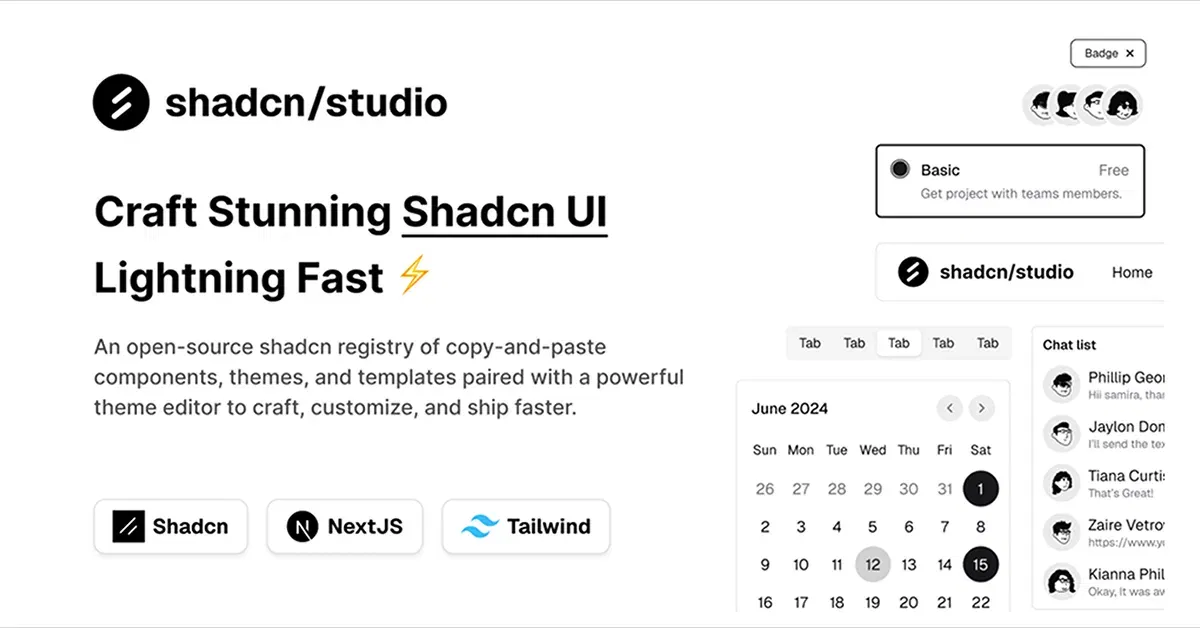
Shadcn/Studio - Theme Editor
Open-source Shadcn registry with copy-paste components.
Tailwind Dark Mode Templates: Enhance Your User Experience
In today’s digital world, Dark Mode has become an essential feature for many websites and applications. It not only helps reduce eye strain in low-light environments but also adds a modern, sleek aesthetic to your designs. Tailwind CSS, with its utility-first approach, makes implementing Dark Mode incredibly easy and efficient.
In this article, we will explore Tailwind Dark Mode Templates, highlighting the benefits of using dark mode and how Tailwind’s framework allows you to quickly create customizable, responsive dark mode layouts and themes for your website or app.
What Are Tailwind Dark Mode Templates?
Tailwind Dark Mode Templates are pre-designed user interface templates built using Tailwind CSS that include dark mode features. These templates are fully responsive and customizable, designed to automatically switch between dark and light modes based on the user’s preferences or system settings.
Tailwind CSS simplifies the implementation of dark mode by providing built-in utilities that allow developers to toggle styles between light and dark themes without needing to write custom JavaScript or CSS. These templates come with ready-to-use components, layouts, and styles that make it easy to integrate dark mode functionality into your project.
Why Use Tailwind Dark Mode Templates?
Easy Customization: Tailwind’s utility-first approach allows for quick modifications to any element within your dark mode template. Change colors, spacing, typography, and more to suit your project’s needs.
User Experience: Offering a dark mode option improves accessibility and user experience, especially for those who prefer darker screens to reduce eye strain.
Responsive Design: Tailwind’s responsive utilities ensure that your dark mode templates look great across devices, from small mobile screens to large desktop displays.
Seamless Integration: Tailwind’s built-in dark mode utilities make it easy to integrate into existing projects. You don’t need to write complex CSS to handle theme switching; Tailwind takes care of it for you.
Consistency: Pre-built templates ensure a consistent design across your entire website or application. With dark mode, users can enjoy a unified experience regardless of their theme preferences.
Key Features of Tailwind Dark Mode Templates
Built-In Dark Mode Support: Tailwind CSS automatically detects the user’s system dark mode settings, switching between light and dark themes without the need for additional code.
Pre-Built Layouts and Components: Ready-to-use UI components such as navigation bars, buttons, cards, forms, and more, all designed to work seamlessly in both dark and light modes.
Customizable Dark Mode Styles: Tailwind lets you easily override default styles with its utility classes to tailor dark mode to fit your brand’s look and feel.
Smooth Transition Effects: Tailwind makes it simple to add smooth transitions between light and dark modes, enhancing the visual experience when switching themes.
User-Friendly: Tailwind's structure makes it easy for developers of all levels to implement and customize dark mode without needing a deep understanding of CSS or JavaScript.
How to Implement Dark Mode with Tailwind CSS?
Tailwind CSS makes it easy to implement dark mode across your site. Here’s a quick guide to setting it up:
Enable Dark Mode in Tailwind Configuration:
To use dark mode, you need to enable it in your Tailwind configuration file (tailwind.config.js):module.exports = { darkMode: 'class', // Use the class-based approach to toggle dark mode theme: { extend: {}, }, plugins: [], }The
'class'option allows you to toggle dark mode by adding thedarkclass to the root element of your site.Creating the Dark Mode Classes:
After setting up dark mode, you can use Tailwind’sdark:prefix to style elements for dark mode. For example:<div class="bg-white text-black dark:bg-gray-800 dark:text-white"> This is a dark mode enabled component. </div>Here,
bg-whiteandtext-blackapply to the light mode, anddark:bg-gray-800anddark:text-whiteapply when dark mode is active.Add Theme Toggle (Optional):
If you want to allow users to toggle between dark and light modes manually, you can use JavaScript to add or remove thedarkclass from the<html>element.const toggleButton = document.getElementById('theme-toggle'); toggleButton.addEventListener('click', () => { document.documentElement.classList.toggle('dark'); });This simple toggle lets users switch between dark and light modes on demand.
Examples of Tailwind Dark Mode Templates
Dark Mode Dashboard:
A sleek, dark-themed admin dashboard featuring a sidebar, charts, and tables. Perfect for data-driven applications.Dark Mode Landing Page:
A beautifully designed landing page with light and dark modes, optimized for any device, and easy to customize with Tailwind’s utilities.Dark Mode E-Commerce Site:
An online store template with dark mode, including product cards, a shopping cart, and a checkout page, all designed to work flawlessly on both light and dark themes.Dark Mode Portfolio:
Showcase your work in a clean, modern portfolio design with a dark mode theme that enhances your content and images.
Conclusion
Dark Mode Tailwind Templates provide an easy way to incorporate dark mode into your projects, offering a seamless, responsive design that adapts to user preferences. With Tailwind’s utility-first classes, you can quickly build and customize dark mode components without needing extensive custom CSS. Whether you’re creating a website, dashboard, or e-commerce platform, integrating dark mode can greatly improve user experience and accessibility, making it a valuable feature for modern web applications.
Take advantage of Tailwind CSS’s dark mode utilities to enhance the functionality and aesthetics of your site with minimal effort, while providing a visually appealing and user-friendly experience for your audience.
Frequently Asked Questions
Explore frequently asked questions about Darkmode Templates
Tailwind Dark Mode Templates are pre-designed UI templates using Tailwind CSS that automatically switch between light and dark themes based on user preferences.
Dark mode is enabled in the tailwind.config.js file by setting darkMode: 'class' to toggle dark mode via the dark class on the root element.
Have a product?
Submit your Tailwind CSS product to All Tailwind, get featured, and drive genuine traffic while showcasing your work to the world. Turn your creativity into revenue and begin selling today! 🚀