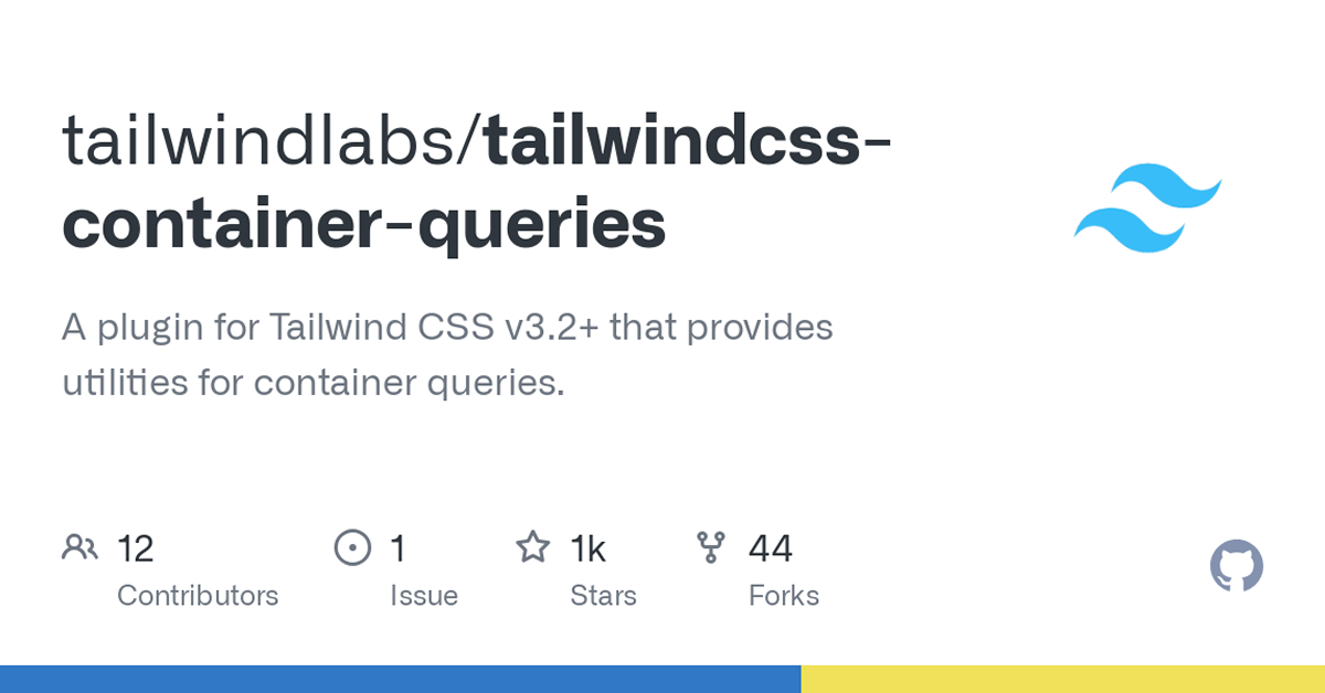
Details about Tailwind Container Queries Plugin
Enables container queries in Tailwind CSS projects
Create responsive layouts based on container size, not just viewport
Seamlessly integrates with Tailwind's utility-first approach
Free and open-source plugin
Easy installation and usage
#What is Tailwind CSS Container Queries?
The Tailwind CSS Container Queries plugin brings a powerful feature to Tailwind CSS: container queries. Traditionally, responsive design in CSS has relied on viewport size (the window size) to change styles. With container queries, however, elements can adapt based on their container’s size, making it easier to build highly responsive and adaptive layouts that work across a variety of contexts, not just screen sizes.
This plugin empowers developers to create more dynamic, flexible layouts that adjust based on the surrounding container, leading to better user experiences across multiple devices and container contexts. Whether you're building components that need to be responsive within specific sections of your site or designing more complex layouts, this plugin is a valuable tool to have in your Tailwind-based design workflow.
#Features ⚡️
Responsive Containers: Apply different styles based on the container's size, rather than the viewport, allowing for more granular control over layout adjustments.
Simple Class Syntax: Use Tailwind's utility-first classes to define responsive behaviors directly in your markup.
Container Queries Syntax: Enable container queries with classes like
@containerandcontainer-{breakpoint}, making it easy to manage complex layouts.Seamless Integration: Works perfectly with Tailwind CSS, complementing its existing utility classes without breaking the flow of your development process.
Customizable Breakpoints: Define custom container breakpoints, so elements inside a container can change their layout and style based on the container's size.
Free and Open Source: The plugin is fully free and open-source, maintained by the Tailwind Labs team, with active community contributions.
#Pros and Cons
#✅ Pros
Increased Layout Flexibility: Container queries allow for more flexible and responsive layouts that adapt not only to the viewport but also to the context of the surrounding containers.
Utility-First Approach: The plugin integrates seamlessly with Tailwind's utility-first philosophy, making it easy to implement without writing custom CSS.
Responsive Components: Ideal for building components that need to adjust within specific containers, such as cards, modals, or grids that need different styles based on container width.
Custom Breakpoints: Tailwind’s custom breakpoint support ensures that you have full control over when the layout shifts, based on the container size.
Open-Source: The plugin is free, and with contributions from the community, it’s continuously updated and maintained.
#⚠️ Cons
Limited Browser Support: Container queries are still a relatively new feature in CSS and may not be fully supported in all browsers, particularly older versions.
Not for All Layouts: While powerful, container queries are most effective for responsive components within containers and may not be as useful for broader site-wide layout adjustments.
#Included Components - Templates
While the Tailwind CSS Container Queries plugin itself doesn’t provide specific templates, it empowers developers to build fully responsive components that adjust based on the container's size. Some practical use cases include:
Responsive Cards: Cards that change layout and size based on their container’s width, adjusting image sizes or text alignment for a better layout.
Grids: Build dynamic grids that reflow based on the container's size, creating an adaptive layout for products, articles, or images.
Modals and Popups: Ensure that modals or popups look great within different containers, whether they’re used in a sidebar, full-screen, or within a smaller widget.
Navigation Menus: Build navigation elements that adjust based on the available space, such as horizontal or vertical menus that change depending on the container’s width.
#Pricing 💵
The Tailwind CSS Container Queries plugin is completely free and open-source. There are no premium versions or paid features. You can freely use it in personal or commercial projects.
#Integrations 🧰
This plugin integrates seamlessly with Tailwind CSS, enhancing its responsive design capabilities. It works alongside existing Tailwind utilities, so if you're already using Tailwind, you don’t need to change your workflow to use this plugin.
Tailwind CSS: The plugin is built to integrate directly with Tailwind, adding container query support to your utility classes without requiring additional custom CSS.
Custom Configurations: You can also configure custom breakpoints, allowing container queries to work exactly how you need them in your project.
Frequently Asked Questions
How do container queries differ from media queries?
Unlike traditional media queries that apply styles based on the viewport size, container queries allow elements to adjust styles based on their containing element's size. This gives you more control over individual elements within a layout.
Can I define custom breakpoints for container queries?
Yes, Tailwind's plugin supports custom breakpoints, so you can define the size at which the container query should trigger and adjust the layout accordingly.
Is container query support available in all browsers?
Container queries are still a relatively new feature in CSS, so they may not be fully supported in all browsers, particularly older versions. Check compatibility before using it in production.
Is the plugin free to use?
Yes, the Tailwind CSS Container Queries plugin is completely free and open-source, with no paid plans or hidden features.
Tailwind Container Queries Plugin
Plugin for Tailwind CSS that provides utilities for container queries.
Resource Types:
UI Kits :
Tailwind UITechnology Stack :
Have a product?
Submit your Tailwind CSS product to All Tailwind, get featured, and drive genuine traffic while showcasing your work to the world. Turn your creativity into revenue and begin selling today! 🚀


