Details about Tailwind CSS Radix - Utility-First Styling
Utility class presets for styling Radix UI components with Tailwind.
Enhances accessibility and UI consistency.
Offers configurable styles for complex components like modals, tooltips, popovers.
Great for building headless, accessible components faster.
#What is Radix?
Tailwind CSS Radix is a utility-first styling toolkit designed to work seamlessly with Radix UI, a library of accessible, unstyled UI primitives for React. This integration offers ready-to-use Tailwind utility classes mapped to each Radix component, helping developers save time styling advanced UI elements like dialogs, dropdowns, and tooltips without starting from scratch. It's ideal for teams that want control over their design but need speed and accessibility out of the box.
#Features
Tailwind Styling for Radix UI: Preset class utilities for all Radix UI components, keeping your design consistent and accessible.
Headless Component Support: Maintains Radix's unstyled philosophy while speeding up implementation.
Responsive & Dark Mode Ready: All utility classes follow Tailwind conventions, including support for dark mode and responsive breakpoints.
Modular Utility Config: Organized by component (e.g.,
dialog,tooltip,dropdown-menu), allowing selective usage.Accessible by Default: Inherits accessibility best practices from Radix UI primitives.
#Pros and Cons
#Pros
Saves Time: Removes the boilerplate when styling complex components like tooltips or popovers.
Tailwind Native: Perfect fit for projects already using Tailwind CSS.
Keeps Radix Flexibility: Still gives full control over styling while accelerating common UI patterns.
Accessibility Focused: Leverages Radix’s commitment to WCAG-compliant interfaces.
#Cons
Radix Only: Only useful if you're using Radix UI—it won’t help with other component libraries.
Learning Curve for Radix: Some devs new to Radix may need time to understand how the primitives work.
Not a Component Library: Doesn’t provide full UI components—just utility class mappings.
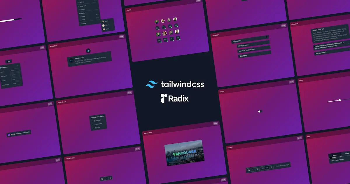
#Included Components - Templates
The project provides utility class mappings for:
Dialog / Modal
Popover
Tooltip
Dropdown Menu
Accordion
Tabs
Hover Card
Context Menu
Each comes with suggested Tailwind utility patterns for both trigger and content elements.
#Pricing
Open Source: Completely free under MIT License.
Hosted on GitHub and Vercel.
#Integrations
Tailwind CSS: 100% Tailwind-compatible.
Radix UI: Built specifically to enhance Radix UI styling.
Custom Themes: Easily theme-able via Tailwind config.
Frequently Asked Questions
Is Tailwind CSS Radix free?
Yes, it’s open source and MIT-licensed.
Do I need to install Radix UI separately?
Yes, Tailwind CSS Radix only provides utility styles; you must install Radix UI primitives yourself.
Can I override the default classes?
Absolutely. The utilities are suggestions—you can fully customize them in your Tailwind setup.
Does it support dark mode?
Yes, the utility classes support dark mode using Tailwind’s dark: variant.
Can I use it with other frameworks besides React?
Not directly—Radix UI is React-only, so this tool is tied to that ecosystem.
Tailwind CSS Radix - Utility-First Styling
A utility-first toolkit designed to work seamlessly with Radix UI.
Resource Types:
UI Kits :
Tailwind UITechnology Stack :


Have a product?
Submit your Tailwind CSS product to All Tailwind, get featured, and drive genuine traffic while showcasing your work to the world. Turn your creativity into revenue and begin selling today! 🚀