Tailwind CSS Cards
Collection of responsive, customizable Tailwind CSS card components perfect for dashboards, portfolios, blogs, and e-commerce projects.
Explore Cards

Featured Tailwind Products
Add Featured Product
Vuexy MUI Next.js Template
By Pixinvent
Vuexy MUI NextJS Admin Template with modern layouts and UX design.


Latest Tailwind Cards
Submit Product
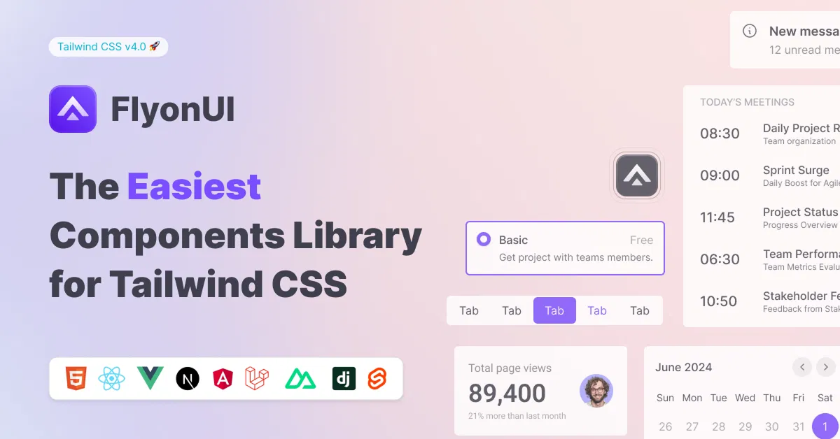
FlyonUI - Free Tailwind CSS Components
Open-source Tailwind CSS components library.

Shadcn/Studio - Theme Editor
Open-source Shadcn registry with copy-paste components.
Tailwind Cards Components Collection
Welcome to our extensive collection of Tailwind Cards components, crafted to help you build stunning, responsive, and highly customizable card layouts with ease. Cards are an essential UI element used across websites and applications to organize content in visually appealing, digestible blocks. Leveraging the power of Tailwind CSS, these components offer unmatched flexibility and performance for your frontend projects.
Why Use Tailwind Cards?
Cards provide a clean and consistent way to display grouped information such as user profiles, products, blog posts, testimonials, pricing plans, and more. With Tailwind CSS's utility-first approach, our card components are easy to customize and extend without writing complex CSS, allowing developers and designers to:
Build responsive layouts that adapt smoothly to all screen sizes
Create visually engaging components with minimal effort
Maintain consistent styling and spacing using Tailwind's design tokens
Quickly prototype or integrate into existing projects
Easily modify colors, shadows, borders, and animations to match branding
What You’ll Find in This Collection
Our Tailwind Cards category features a wide variety of card styles suitable for many use cases, including but not limited to:
Profile Cards: Show user photos, social links, and bio information with clean, modern designs.
Product Cards: Highlight product images, pricing, and call-to-action buttons optimized for e-commerce.
Blog Post Cards: Showcase blog titles, excerpts, author info, and read time in a reader-friendly format.
Pricing Cards: Present pricing tiers, features, and signup buttons with emphasis on clarity and hierarchy.
Testimonial Cards: Display customer reviews with star ratings, profile images, and quotes.
Image Gallery Cards: Focus on rich media presentation with overlay effects and interactive features.
Feature Cards: Highlight key services, benefits, or features with icons and descriptive text.
Each card is thoughtfully designed to balance aesthetics with usability, and built entirely with Tailwind CSS utilities for lightning-fast customization.
Benefits of Using Our Tailwind Card Components
Fully Responsive: Designed mobile-first and tested across multiple devices.
Accessibility-Friendly: Semantic HTML structure and ARIA attributes included where relevant.
Performance Optimized: Minimal CSS footprint by utilizing Tailwind's atomic classes.
Easy Customization: Modify styles instantly by adjusting Tailwind classes.
Clean Codebase: Well-structured HTML and comments for effortless maintenance.
Reusable & Scalable: Perfect for small projects or complex applications alike.
How to Use These Cards in Your Project
Browse the collection and select a card that fits your use case.
Copy the HTML markup directly into your project.
Customize colors, spacing, fonts, and interactivity using Tailwind utility classes.
Integrate with your framework or CMS as needed (React, Vue, Laravel, WordPress, etc.).
Deploy with confidence knowing your UI components are lightweight and tested.
Start Building Stunning Interfaces Today
Cards are foundational UI elements that improve user experience by organizing information clearly and attractively. Our Tailwind Cards collection empowers you to create modern, functional, and beautiful interfaces effortlessly. Whether you’re a developer looking for reusable components or a designer aiming for pixel-perfect layouts, these Tailwind card components are your go-to solution.
Conclusion:
Tailwind Cards are a powerful and flexible way to showcase your content with clarity and style. By leveraging the utility-first approach of Tailwind CSS, these components offer unmatched ease of customization, responsiveness, and performance. Whether you’re building dashboards, portfolios, e-commerce sites, or blogs, using well-designed card components can significantly enhance the user experience and interface consistency.
Explore our diverse collection of Tailwind Components to find the perfect design that fits your project’s needs, and accelerate your development workflow with clean, reusable, and visually appealing UI elements. Start integrating these components today and deliver professional, engaging web applications with minimal effort.
Frequently Asked Questions
Explore frequently asked questions about Cards
Tailwind Cards are UI components styled using Tailwind CSS utility classes to display grouped content in a clean, organized layout.
Yes, the HTML structure can be easily integrated into React, Vue, or any frontend framework.
Have a product?
Submit your Tailwind CSS product to All Tailwind, get featured, and drive genuine traffic while showcasing your work to the world. Turn your creativity into revenue and begin selling today! 🚀