Details about Choc UI - Chakra UI Components
Prebuilt Chakra UI components for rapid development
Responsive and color mode flexible designs
Live code editor with preview and export options
Open-source under the MIT license
Built with React, Next.js, and TypeScript
Hosted on Vercel
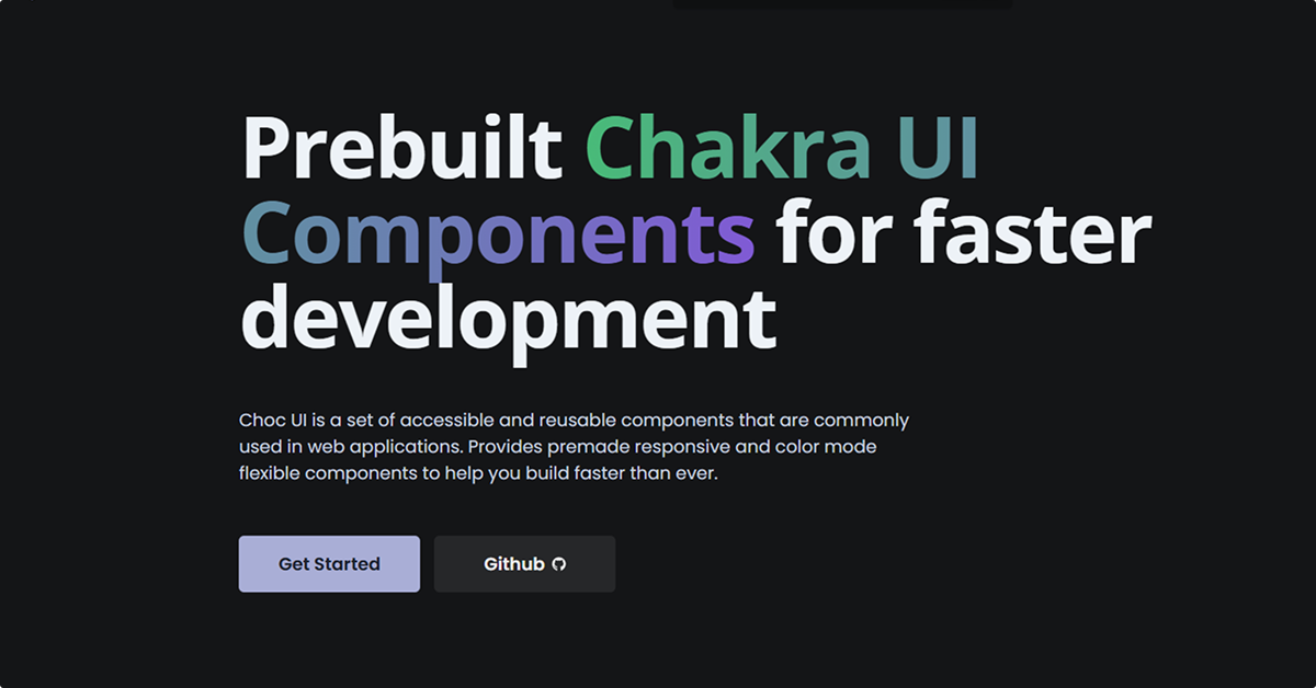
#What is Choc UI?
Choc UI is a collection of accessible and reusable components built on top of the Chakra UI library. Designed to accelerate the development process, Choc UI offers a variety of pre-designed components and templates that are responsive and adaptable to different color modes. With features like a live code editor and easy integration into React projects, Choc UI serves as a valuable resource for developers seeking to build modern web applications efficiently.
#Features
Prebuilt Components: Offers a wide range of components such as headers, cards, alerts, pagination, badges, and more, ready to use in projects.
Responsive Design: Components are designed to be fully responsive, ensuring compatibility across various devices and screen sizes.
Color Mode Flexibility: Supports both light and dark modes, allowing for seamless theme integration.
Live Code Editor: Includes an in-browser code editor that enables developers to view, edit, and preview components in real-time.
Export Options: Provides functionalities to copy code, open in a new tab, or launch in CodeSandbox for further development.
Open Source: Available under the MIT license, encouraging community contributions and usage in various projects.
#Pros and Cons
#Pros
Accelerated Development: Prebuilt components reduce the time required to design and implement UI elements.
Customization: Components can be easily customized to fit specific project requirements.
Integration: Seamless integration with React and Chakra UI projects.
Community Support: Being open-source, it benefits from community contributions and shared improvements.
#Cons
Chakra UI Dependency: Primarily built for Chakra UI; may require adjustments for use with other UI libraries.
Limited Backend Integration: Focuses on frontend components; backend functionalities need to be implemented separately.
#Included Components - Templates
Choc UI offers a diverse set of components and templates, including:
UI Elements: Headers, cards, alerts, pagination, badges, gradient icons, carousels.
Page Sections: Hero sections, feature sections, call-to-action areas, pricing sections, testimonials, blog sections, contact sections, footers.
Navigation: Navbars, vertical menus, sidebar navigation.
Headings: Card headings, section headings, page headings.
Example Pages: Landing pages, contact pages, error pages, home screens, detail screens, settings screens.
Forms: Form layouts, sign-in and registration forms.
Lists: Tables, stacked lists, grid lists, feeds.
Application Shells: Sidebar layouts, page layouts, stacked layouts, multi-column layouts.
#Pricing
Choc UI is free and open-source, licensed under the MIT license. Developers can access and use the components without any cost.
#Integrations
React: Components are built for seamless integration with React applications.
Chakra UI: Designed to work in tandem with the Chakra UI library.
Next.js: Utilizes Next.js for server-side rendering and routing.
TypeScript: Written in TypeScript, ensuring type safety and better developer experience.
CodeSandbox: Supports opening components directly in CodeSandbox for further development and testing.
Frequently Asked Questions
What is Choc UI?
Choc UI is a collection of prebuilt, accessible, and reusable components built on top of the Chakra UI library, aimed at accelerating the development of modern web applications.
Is Choc UI free to use?
Yes, Choc UI is free and open-source, available under the MIT license.
Can I use Choc UI components in my existing React project?
Absolutely. Choc UI components are designed for easy integration into React projects that utilize Chakra UI.
How can I customize Choc UI components?
Components can be customized using Chakra UI's theming capabilities and utility props, allowing for extensive styling and behavior modifications.


Have a product?
Submit your Tailwind CSS product to All Tailwind, get featured, and drive genuine traffic while showcasing your work to the world. Turn your creativity into revenue and begin selling today! 🚀