
Shadcn UI
A comprehensive and modern UI component library to build clean, responsive, and highly customizable user interfaces.


Featured Tailwind Products
Add Featured Product
JetShip - Next.js SaaS Boilerplate
Next.js Starter Kit with TypeScript, Shadcn, Tailwind & Supabase.

Vuexy MUI Next.js Template
By Pixinvent
Vuexy MUI NextJS Admin Template with modern layouts and UX design.


Latest Shadcn UI Resources
Submit ProductFilters
Filters
Category
Resource Type
Technology Stack

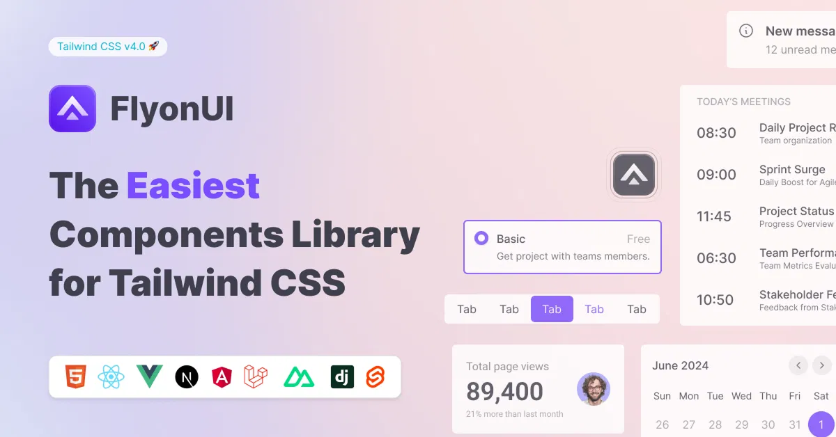
FlyonUI - Free Tailwind CSS Components
Open-source Tailwind CSS components library.


8bitcn/ui
Accessible retro components that you can copy and paste for your apps.

Tweakcn - Shadcn Theme Editor
Customize theme for shadcn/ui with tweakcn's interactive editor.

Shadcn for Vue - Shadcn/Vue
Beautifully designed components built with Radix Vue and Tailwind CSS.

JollyUI
Shadcn/UI components: accessible, customizable, open-source.

Cult UI – Shadcn UI Components & Templates
Open-source Shadcn UI components and templates for TypeScript/Next.js.


Circle by lndev-ui
Project management app, built with Next.js and Shadcn/UI.

Shadcn/Studio - Theme Editor
Open-source Shadcn registry with copy-paste components.


JetShip - Next.js SaaS Boilerplate
Next.js Starter Kit with TypeScript, Shadcn, Tailwind & Supabase.

MynaUI Icons
Beautifully crafted open source icons for your next project.

Indie UI: Component Library
Easily enhance your website with React, Shadcn, and Framer Motion.

Shadcn - Landing template
Landing page template with Next.js, Shadcn, TypeScript & Tailwind.

Big Calendar - Feature Rich Calendar
Feature-rich calendar app built with Next.js, TypeScript & Tailwind.
Shadcn UI: The Future of Customizable Component Libraries
In the ever-evolving landscape of web development, Shadcn UI has emerged as a game-changer for developers seeking flexibility, accessibility, and seamless integration. Unlike traditional component libraries, Shadcn UI offers a unique approach that empowers developers to build and customize their own component libraries.
At All TailwindCSS, you will find shadcn based Tailwind CSS Templates, Tailwind CSS Components & Tailwind CSS Tools.
What is Shadcn UI?
Shadcn UI is not just another component library; it’s a collection of reusable components that you can copy and paste into your codebase. By providing the actual component code, Shadcn UI allows for complete control over customization and eliminates the need for external dependencies. This approach reduces versioning issues and ensures that your components are always up-to-date.
Core Features:
Following are the core features of Shadcn UI which makes it awesone.
Built on Radix UI and Tailwind CSS
Shadcn UI leverages Radix UI’s headless primitives to deliver accessible and customizable components. With Tailwind CSS, developers can style the shadcn components using utility-first classes, enabling rapid development and consistent design.
2. Accessibility First
Every component in Shadcn UI is built with accessibility in mind, ensuring compliance with Web Content Accessibility Guidelines. This focus on accessibility makes it easier to create inclusive web applications.
3. Customization and Theming
Shadcn UI offers exceptional flexibility in customization and theming. Developers can modify styles, create variants, and adjust components to match their project’s unique design requirements. This level of customization allows for the maintenance of consistency with your design system while leveraging the robust foundation provided by Shadcn UI.
4. Code Ownership
By integrating Shadcn UI into your project, you own the component code. This ownership eliminates dependency overhead and allows for direct modifications, ensuring that your components evolve with your project’s needs.
5. AI Integration Ready
Shadcn UI’s open code structure makes it straightforward for AI models to read, understand, and even improve your components. This AI-readiness positions Shadcn UI as a forward-thinking solution in the realm of web development.
How to Add Shadcn to Existing Project?
Shadcn UI offers a great level of flexibility and control for developers who want to use customizable, headless UI components combined with Tailwind CSS. By following the installation steps and configuring Tailwind CSS, you can integrate and style components with ease while maintaining full control over the UI elements.
To use Shadcn UI in your project, follow these steps:
1. Installation
Shadcn UI is built on top of Radix UI and Tailwind CSS, so you need to set up both to get started.
Install the dependencies:
npm install @radix-ui/react-<component> tailwindcss
Replace <component> with the specific Radix UI component you're using (like @radix-ui/react-dialog for Dialog components).
2. Configure Tailwind CSS
If you don't already have Tailwind CSS set up, you can configure it with the following steps:
Install Tailwind CSS in your project:
npm install -D tailwindcss postcss autoprefixer
npx tailwindcss init
Add the Tailwind CSS configurations to your
tailwind.config.js:module.exports = { content: [ './src/**/*.{js,jsx,ts,tsx}', './node_modules/@radix-ui/react-*/dist/**/*.{js,jsx,ts,tsx}', // Add this for Radix UI components ], theme: { extend: {}, }, plugins: [], };Add the Tailwind directives to your main CSS file:
@tailwind base;
@tailwind components;
@tailwind utilities;
3. Using Shadcn UI Components
Shadcn UI leverages Radix UI for headless components and uses Tailwind for styling. Here's an example of how to use a Button component from Shadcn UI:
Import the necessary components:
import { Button } from '@shadcn/ui';Add the component to your JSX code:
const App = () => (
  <div className="flex justify-center items-center h-screen bg-gray-100">
    <Button className="bg-blue-500 text-white py-2 px-4 rounded-lg">
      Click Me
    </Button>
  </div>
);
Customize the component using Tailwind CSS classes as needed.
4. Theming and Customization
Shadcn UI components are highly customizable. You can adjust the styling of each component using Tailwind's utility classes. For example:
Modify the button background color, padding, and text color.
Customize the dialog modal or other components by overriding default Tailwind styles.
<Button className="bg-red-500 text-black hover:bg-red-700 px-5 py-2 rounded-md">
  Customized Button
</Button>
5. Creating Custom Components
One of Shadcn UI’s biggest advantages is the ability to create your own custom components. You can modify existing ones or build new ones based on Radix UI primitives.
For example, to create a custom dialog:
import { Dialog } from '@radix-ui/react-dialog';

const CustomDialog = () => (
  <Dialog>
    <Dialog.Trigger className="bg-blue-600 text-white px-4 py-2 rounded-md">
      Open Dialog
    </Dialog.Trigger>
    <Dialog.Content className="bg-white p-6 rounded-lg shadow-lg">
      <h2 className="text-xl font-bold">Custom Dialog</h2>
      <p>Content inside your custom dialog goes here.</p>
      <Dialog.Close className="bg-gray-500 text-white px-4 py-2 rounded-md">
        Close
      </Dialog.Close>
    </Dialog.Content>
  </Dialog>
);
6. Refer to the Documentation
For more details on components, customization, and setup, visit the Shadcn UI documentation.
7. Deploying Your Project
After integrating Shadcn UI components and customizing them, deploy your project as you normally would with frameworks like Next.js, Gatsby, or Vite.
The platform supports various frameworks, including Next.js, Gatsby, Remix, Astro, Laravel, and Vite. Additionally, there are starter templates available for seamless integration.
Conclusion
Shadcn UI stands out as a modern solution for developers seeking control, accessibility, and customization in their UI components. By adopting Shadcn UI, you can build a component library tailored to your project’s needs, ensuring scalability and consistency across your application.
At All TailwindCSS you will find the best Tailwind shadcn templates, tools, components & much more. So check out the collection of the best Tailwind Shadcn resources and take your project to the next level.
Frequently Asked Questions
Explore frequently asked questions about Shadcn UI
A comprehensive and modern UI component library that empowers developers to build clean, responsive, and highly customizable user interfaces.
To use Shadcn UI in React, install the necessary dependencies, configure Tailwind CSS, and import the components from Shadcn UI. Customize the components with utility classes from Tailwind CSS to match your design needs, and place them in your React components as needed.
Have a product?
Submit your Tailwind CSS product to All Tailwind, get featured, and drive genuine traffic while showcasing your work to the world. Turn your creativity into revenue and begin selling today! 🚀